AI Doesn't Know it Knows

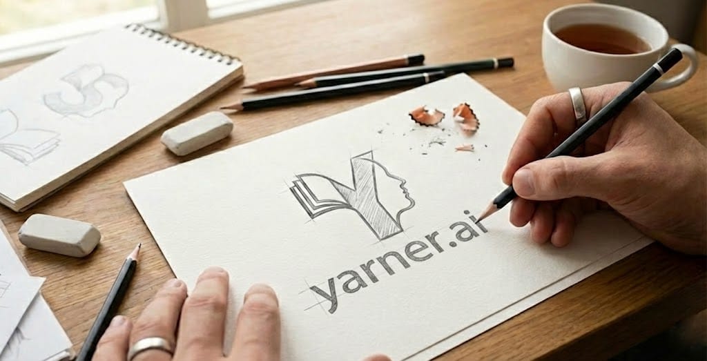
I wanted a logo for this site to brighten things up a bit. Being a cheapskate, instead of paying for one, I decided to generate 50kg of greenhouse gases and use Gemini instead.
With childish anticipation of the visual delights ahead, I enthusiastically entered the following prompt:
Design a logo for my new site, yarner.ai
White background.
Theme is ai story telling.
Keep it clean slick and modern.
What on earth...It's like Starbucks and Intel had a baby. Clearly, we have some work to do here:
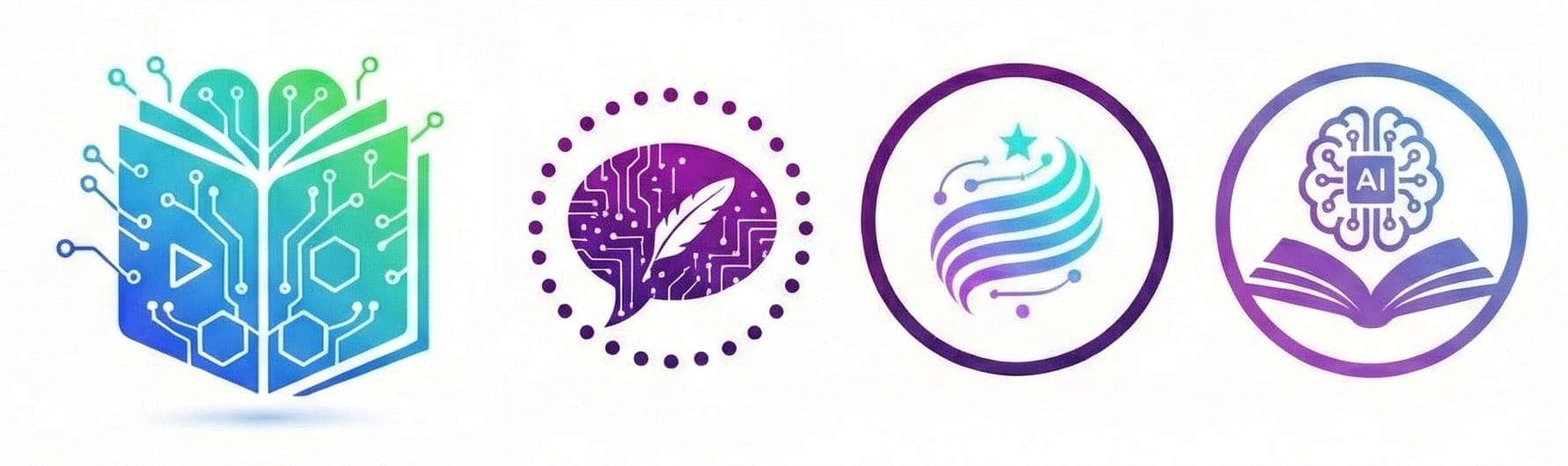
Hmm, we seem to be in a death spiral of disappointment. After more frustrating iterations, I was suspicious that Gemini was deliberately holding out on the good stuff!
Give me an honest appraisal of your last logo!
Here is an honest, graphic design-focused appraisal of that last logo, specifically looking at proportion, spacing, and its effectiveness as a "classic" brand mark.
The Verdict: It's Overcrowded
While it attempts a classic "badge" layout by putting everything inside a circle, it fundamentally misses the mark of what makes major brand logos effective: scalability and breathing room. Because your site focuses on delivering complete, seamless narratives without interrupting the user's flow, the branding should mirror that effortless, uninterrupted experience. Right now, this logo feels rigid and over-engineered...
Gemini continued picking apart all of its own hard work, with specifics about proportion, 'negative space' and all manner of design language that I didn't really understand. It was painful witnessing such brutal self-reflection.
With its new-found self-awareness, I fed that back and continued with better iterations and more critique. A little vector tracing and colouring in Affinity Designer later, we ended up with this:
I'm not expecting to leap on stage at the logo Oscars, but I was happy with the clean simplicity - it was expressive of what I wanted to convey. It looks a bit like a book, with some yarn-like curves and it even looks like a 'Y'. Plus the little star for obligatory 'AI' emphasis.
That's great, but what has this got to do with writing stories?
I'm glad you asked. Quickly ask your favourite AI chatbot to create a short story. It will generate something readable but bland, likely full of literary clichés and stereotypes.
Then, ask the same chatbot to list 20 literary clichés and stereotypes...
See what it did there? Clearly it 'knows' about these things and how they can negatively impact prose, but it doesn't seem to join the dots when that knowledge would be clearly appropriate for the writing task in hand.
Having been trained on trillions of lines of text, I would expect my AI to know a thing or two about, well, everything, and it does.
Think about that for a moment. The same AI that can instantly list every tired trope in the book will happily fill your story with them! It's not ignorance - it's a strange disconnection between knowing and doing.
Bridging that gap is one of the most fascinating challenges in working with AI creatively. It's one of the areas where I intend to dig deeply, and in later posts we'll see what happens when AI is forced to practice what we know it can preach.